A good room colour combination makes a space feel planned, not random. Two colours, used with intent, beat five colours used without a plan. This guide gives you 11 room colour combinations that work in real homes. You’ll also learn the 70/30 rule, how to test shades, and which pairings to avoid.
Colour is the cheapest way to change a room. It’s also the easiest thing to get wrong. The fix is simple. Pick two shades that share an undertone. Then give each one a clear job. That’s it. The rest is testing, patience, and a little restraint.
Before You Start
Tick these off as you gather them. Nothing here is specialised.
- Photos of your room in daylight and lamplight
- Swatches of fixed features: floor, sofa, curtains, tiles
- Sample pots of your top three colour pairs
- Large white cards for test patches
- Painter’s tape, pencil and a notebook
- A tape measure for wall area estimates
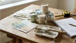
Room Colour Combination at a Glance: Undertone, Mood and Best Rooms
Every room colour combination rests on undertones. Undertone means the faint warm or cool cast hiding inside a paint colour. Two colours with matching undertones sit together calmly. Two with clashing undertones feel wrong, even when you can’t name why. Check undertones in daylight before you buy anything.
Mood follows the pair you pick. Warm pairs like terracotta and cream feel sociable and cosy. Cool pairs like navy and white feel crisp and calm. Bedrooms suit restful pairs. Living rooms handle bolder contrast. Kitchens need wipeable finishes more than perfect palettes.
Your floor sets the undertone tone. A warm timber floor fights cool grey walls. Match undertones across surfaces, then the paint sits naturally. If you’re choosing rugs to tie a room together, this guide to wool rugs and carpet runners helps you pick textures that support the palette.
Swatch Strip and Paint Codes
Name real codes when you shop so the store mixes the right tin. Asian Paints Ivory (0315) with Honey Mustard (7880) ranks as a top 2026 bedroom pair in India. AapkaPainter’s dual tone guide confirms its popularity. For a cooler, more modern choice, white with deep teal works well. For a bold, luxury feel, cream with Deep Sea Blue (9159) delivers strong impact.
Always quote brand and code together. Codes don’t transfer between brands. Photograph swatches in daylight and lamplight, then note the room’s aspect. Screen colours differ from real paint. Buy sample pots first. Judge the dried result on your own wall.
Colours That Pair Beautifully
The strongest room colour combinations share one trait: clear roles. One colour leads, the other supports. The 70/30 rule assigns about 70 percent of the room to the dominant colour and 30 percent to the secondary. This ratio stops the two from fighting for attention. Use the dominant shade on walls and the secondary on furniture, textiles and one accent piece.
Black Colour Combination
Black works as an accent, not a wall colour, in most homes. Pair soft black or charcoal with warm white walls for a crisp modern look. The dark shade makes art pop and hides TV glare on a media wall. Keep ceilings and two walls light so the room stays open. Brass or black hardware suits both tones.
Brown Colour Combination
Brown brings warmth that grey alone can’t match. Pair cream walls with a brown feature wall for a timeless palette. Teak and walnut furniture sit naturally against it. Terracotta and beige offer a lighter take on the same warmth. Design Cafe lists cream and brown among its most reliable living room pairs.
The 11 Combinations
Each pair below earns its place through real room performance, not trend hype.
- White + beige. The safest pair in decorating. White keeps rooms bright; beige adds warmth without weight.
- Navy + white. Classic contrast for living rooms and bedrooms. Navy anchors; white keeps it fresh.
- Sage green + white. Calm and botanical. Works beautifully in rooms full of plants. Keep the greenery alive with this flower care and growing guide.
- Charcoal + warm white. Charcoal on one wall makes art pop; warm white keeps the rest open.
- Terracotta + beige. Warm and earthy. Practical where dust shows on pale walls.
- Olive green + cream. Olive below a dado line, cream above. Needs good daylight.
- Greige + white. Greige blends grey and beige, so it reads warmer than grey alone.
- Blush pink + grey. Soft and romantic for bedrooms. Keep the pink muted, never bubblegum.
- Sky blue + off white. Fresh as a clear morning. One blue feature wall, three off white.
- Forest green + bone. Deep green on cabinetry or one wall, bone on upholstery.
- Mustard + warm grey. Mustard adds personality; warm grey keeps it in check.
| Combination | Mood | Best Room | Budget Note |
|---|---|---|---|
| White + beige | Bright, safe | Any room | Cheapest paint pair |
| Navy + white | Crisp, classic | Living room, bedroom | One dark tin only |
| Sage + white | Calm, natural | Bedroom, study | Mid range greens cost more |
| Charcoal + warm white | Bold, modern | Media wall, study | Needs quality primer |
| Terracotta + beige | Warm, earthy | Living room, dining | Single accent tin |
| Sky blue + off white | Fresh, airy | Bedroom, kids’ room | Budget friendly pair |
Colours to Avoid With It
Some pairs fail no matter how nicely you style them. Avoid two dark colours together in small rooms. The space closes in fast. Avoid clashing undertones, like a warm beige beside a cool blue grey. The eye reads the mismatch as dirtiness. Avoid high contrast colour blocking in bedrooms meant for rest. Bold splits energise rather than calm.
Home Colour Combination
Whole house schemes need one thread tying rooms together. Repeat a single neutral, like warm white, through every room. Vary the accent colour per room for personality. Hallways and stairs carry the neutral so transitions feel smooth.
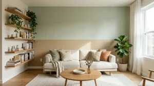
Room Colour Combination Room by Room
Each room has a job, and the pair should serve it. Living rooms host people, so they handle contrast. Bedrooms restore you, so they need calm. Kitchens and baths face steam, grease and splashes, so finish matters as much as hue.
Living Room
Anchor the seating wall in your deeper colour and keep the rest light. Navy behind the sofa with white elsewhere stops a large room feeling empty. In small rooms, keep dark colour to lower elements like the sofa or cabinets, not the ceiling. Pair the palette with pieces that earn their spot. See these simple furniture design ideas for clean, lasting shapes.
Bedroom
Choose calm over drama. Design Cafe’s 2026 bedroom trends favour sage green with ivory, terracotta with cream, and navy with beige. Paint the headboard wall in the deeper tone and the rest in the lighter one. Warm white beats stark white in bedrooms. Stark white can feel clinical at night. Layer the bed with colours that match the walls. This duvet vs comforter guide explains which topping suits which look.
Kitchen and Bathroom
Use colour on lower cabinets and keep walls light and wipeable. Deep green lowers with warm white uppers hide cooking marks well. In bathrooms, pair soft blue walls with white sanitaryware and sandy tiles. Choose moisture resistant paint for baths and kitchens. Keep shower heads clear of mineral build up with this vinegar cleaning method. That way fixtures stay bright against the new walls.
Finish, Lighting and Sample Testing
Finish changes colour as much as light does. Matt emulsion flatters bedroom and living room walls. Eggshell or satin suits kitchens, baths and woodwork because it wipes clean. Test your pair in the room’s real light, not the shop’s.
Pink Colour Combination
Pink pairs need careful handling to stay grown up. Muted blush with warm grey reads elegant in bedrooms. Pink with white suits living rooms when the pink stays dusty, not bright. Balance pink with natural textures like oak and linen.
Test Before You Commit
Run this process for every pair you shortlist. Open a window for ventilation and wear gloves before opening sample pots.
- Buy sample pots of both colours. Small pots cost little and prevent big mistakes.
- Paint large white cards. Two coats on A3 card show the true dried colour.
- Label each card. Write brand, shade name and code on the back.
- Place cards side by side. Tape both to the wall where they will live.
- Check three light conditions. View in morning daylight, afternoon sun and evening lamplight.
- Check against fixed features. Hold cards next to flooring, sofa fabric and curtains.
- Wait 48 hours. Live with the pair for two days before buying litres.
How to Paint a Two Tone Split Wall
A horizontal split divides one wall into two colours for instant architecture. Ventilate the room and wear gloves and old clothes before you start.
- Choose your split height. A dado height split at 90 cm (36 inches) suits most rooms.
- Mark a level line. Use a spirit level and pencil, then run painter’s tape along it.
- Paint the lighter colour first. Cover the whole wall in the light shade with two coats.
- Let it dry fully. Wait the time printed on the tin, usually 4 hours.
- Re tape the line. Press tape firmly along the dry light section.
- Paint the darker section. Apply two coats of the deep colour below the line.
- Peel tape while tacky. Pull at 45 degrees for a crisp edge.
Warning: dark paints can stain unsealed stone sills and strip wax finishes from wood trim.
Shop the Palette
Build your palette from the 11 pairs above, then narrow to three finalists. Order sample pots of each finalist before committing. Compare them on cards in your own light. For two colour inspiration, browse the Two Color Combinations & Contrast Pairs hub and the main Paint, Color & Finishes section.
Royal Blue Colour Combination
Royal blue brings more energy than navy, so use it with restraint. Pair it with warm white walls and natural wood for balance. One royal blue wall in a living room adds drama without overwhelming. In bedrooms, keep royal blue to textiles like curtains and bedding. Brass accents lift the pairing and stop it feeling flat.
What NOT to Do With Room Colour Combinations
Don’t choose colours from a phone screen. Screens shift hues, and greens and blues shift most. Don’t paint the ceiling a dark colour in rooms under 2.4 metres (8 feet). It presses the space down. Don’t use two bold colours at 50/50. One always needs to lead. Don’t skip primer when covering dark with light or light with dark.
Don’t ignore the floor. A warm timber floor fights cool grey walls, so match undertones across surfaces. And keep that floor clean, since smudges spoil the view. These carpet stain removal tips cover the common spills that ruin a tidy scheme.
Don’t forget doors and trim. Painting them the wall colour makes small rooms feel larger. White trim frames each wall crisply. Don’t rush. A 48 hour sample test costs nothing and saves a full repaint.
Key Takeaways
- Use the 70/30 rule: one dominant colour, one supporting colour.
- Match undertones first; warm with warm, cool with cool.
- Repeat one neutral through the whole house for flow.
- Test every pair on large cards in three light conditions.
- Keep dark colours to one wall or lower elements in small rooms.
- Choose wipeable finishes for kitchens and bathrooms.
Common questions
What is the best 2 colour combination for a bedroom?
Ivory with Honey Mustard (7880) ranks as a top 2026 bedroom pair for warmth and versatility. For a cooler look, white with deep teal suits modern rooms. Cream with Deep Sea Blue (9159) gives the boldest impact. In Western markets, sage green with ivory white and navy with beige also perform well. Always test your pair in the room's own light first.
What is the 70/30 rule in room colour?
The 70/30 rule assigns about 70 percent of a room to the dominant colour and 30 percent to the secondary. Paint walls or large furniture in the dominant shade. Carry the secondary through cushions, chairs, rugs and one statement piece. This ratio creates rhythm and stops two colours fighting for attention. It works for nearly every two colour scheme.
Which colour combination makes a room look bigger?
Light neutrals make rooms feel larger: white, soft grey, cream and warm beige. Pair white walls with a pale secondary like soft grey or cream. Keep contrast gentle, since harsh dark light splits chop up small spaces. Paint trim the same colour as walls to blur edges. Good lighting matters as much as colour; dark corners shrink any room.
Can I use dark colours in a small room?
Yes, if you balance them with light neutrals. Restrict the dark colour to one feature wall or to lower elements like sofas and cabinets. Keep the ceiling and remaining walls light to bounce daylight around. Navy, forest green and charcoal all work this way. Avoid dark ceilings in low rooms and avoid painting all four walls dark.
Should walls and furniture be the same colour?
Usually not. Keeping walls lighter and furniture slightly darker creates better visual depth. Same colour walls and sofa can look flat unless you vary texture a lot. If you love a monochrome look, layer different textures: velvet, linen, wood and metal in the same tone. Add one contrasting accent so the eye has somewhere to rest.
What is the best colour combination for a living room?
White with beige rarely goes wrong and suits any style. Navy with white gives classic contrast that anchors large rooms. Sage green with white feels calm in plant filled spaces. Terracotta with beige adds warmth where dust shows. For bolder taste, try mustard with warm grey. Match the pair to your light: dark pairs need good daylight.
How do I match undertones when pairing colours?
Compare swatches side by side in natural daylight. Warm undertones show yellow, peach or brown; cool ones show blue, green or grey. Pair warm with warm and cool with cool. Check undertones in flooring and fixed furniture too, since a warm floor fights cool walls. When in doubt, greige bridges both sides safely.
What two colours go with grey walls?
Warm greys pair with beige, cream, mustard and blush pink. Cool greys pair with white, navy and soft blue. Charcoal grey walls suit brass accents and warm white trim. Avoid pairing grey with another flat neutral without texture, or the room feels dull. Add wood, plants or metallics to warm any grey scheme.
Is beige still in style in 2026?
Yes, beige and warm neutrals lead 2026 bedroom trends, replacing cooler greys. Designers favour soft beige, greige, warm taupe and gentle sand tones. These shades reflect light softly and feel welcoming. Pair beige with olive, terracotta or navy for a current look. Avoid flat beige alone on all walls; layer textures to keep it interesting.
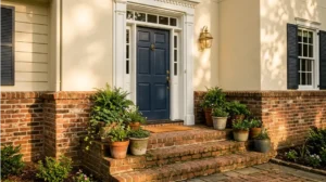
What is a good door colour combination?
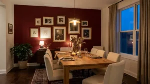
Match your door colour to the room's accent, not its walls. A navy door suits white and beige rooms; a black door suits grey and white schemes. For front doors, deep green, navy and charcoal lead 2026 trends. Keep interior doors consistent through the house for flow. For bold options, see Purple Contrast Color, Pairings, Room Ideas and Paint Codes. For warm rich doors, try Maroon Colour Combination: 12 Ways to Use It (and What It Pairs With).
Was this article useful?